Hello I am Tyler Parker this is my Art portfolio

This piece is inspired by the look of lumpy flesh. I have created this to show how many people may feel about their body and how uncomfortable and continuous they feel.
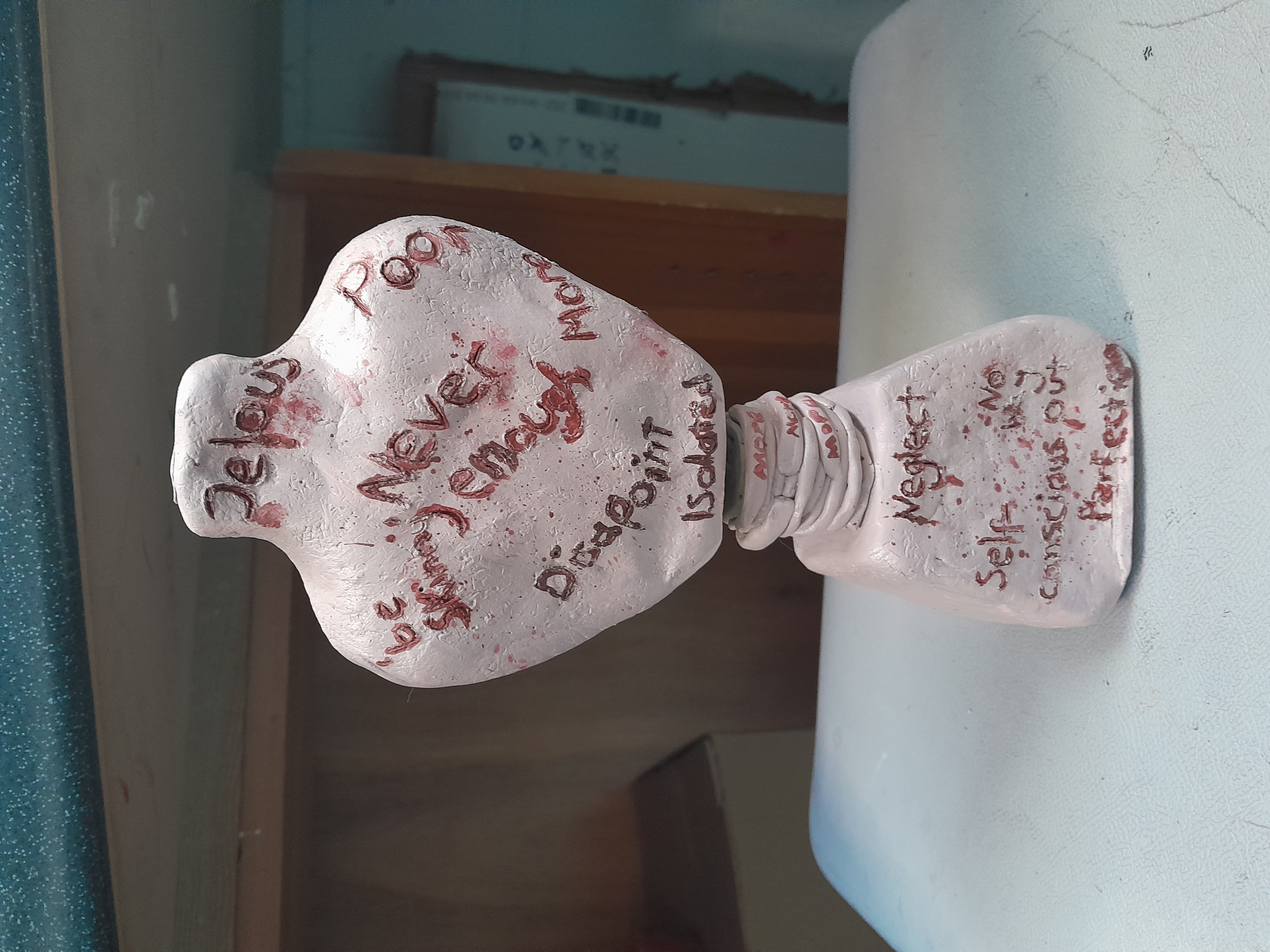
This piece is meant to symbolise the way people who are ‘thin’ feel. The words etched in red are meant to symbolise the things that are said to them or the things that they think about. The knotted stomach displays that they feel like they should be even skinnier, despite already being underweight. This shows awareness of Bulimia.
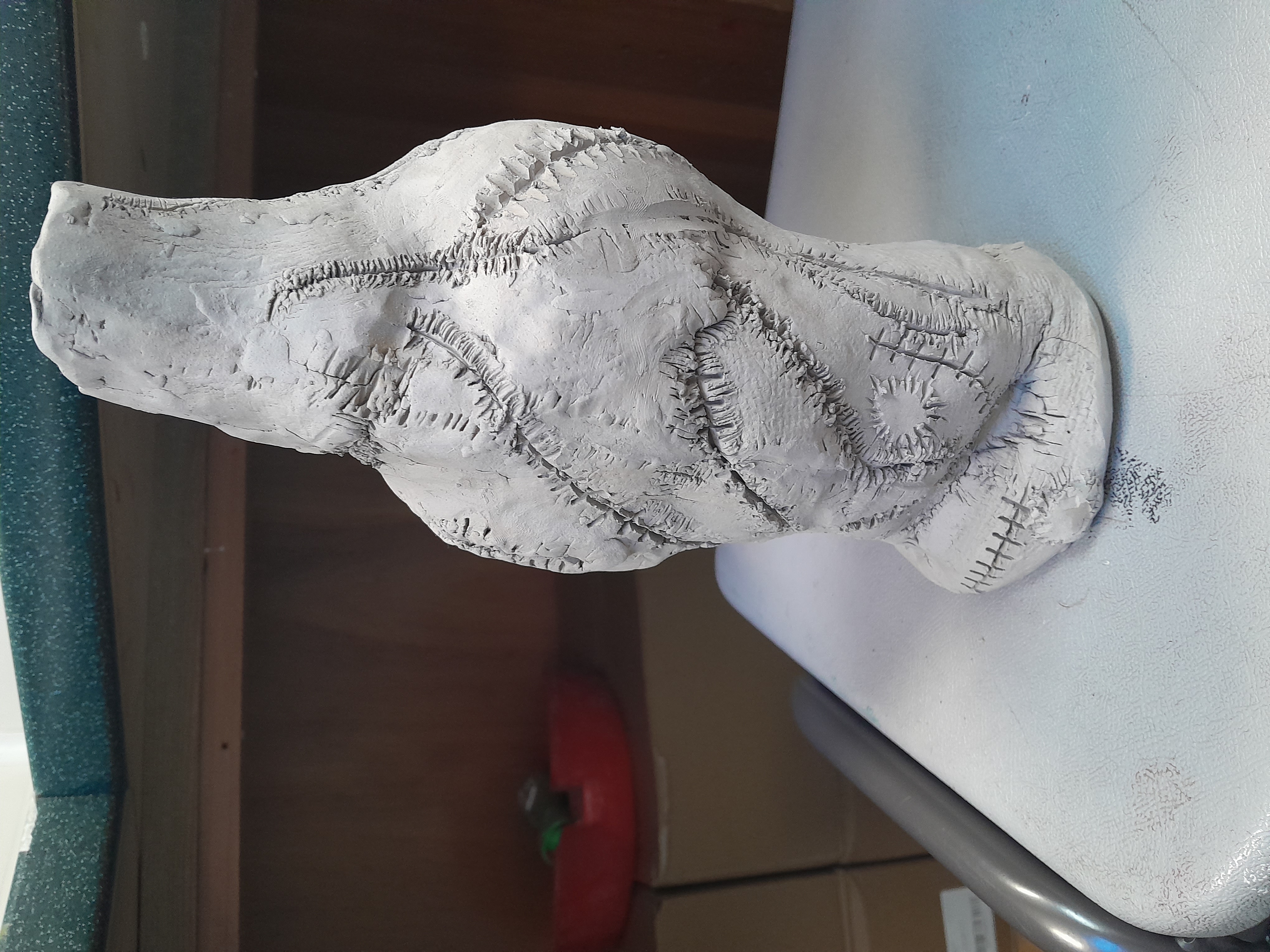
The clay piece here describes someone who feels broken or destroyed by their weight and how it has emotionally, mentally or physically scarred from their experiences.
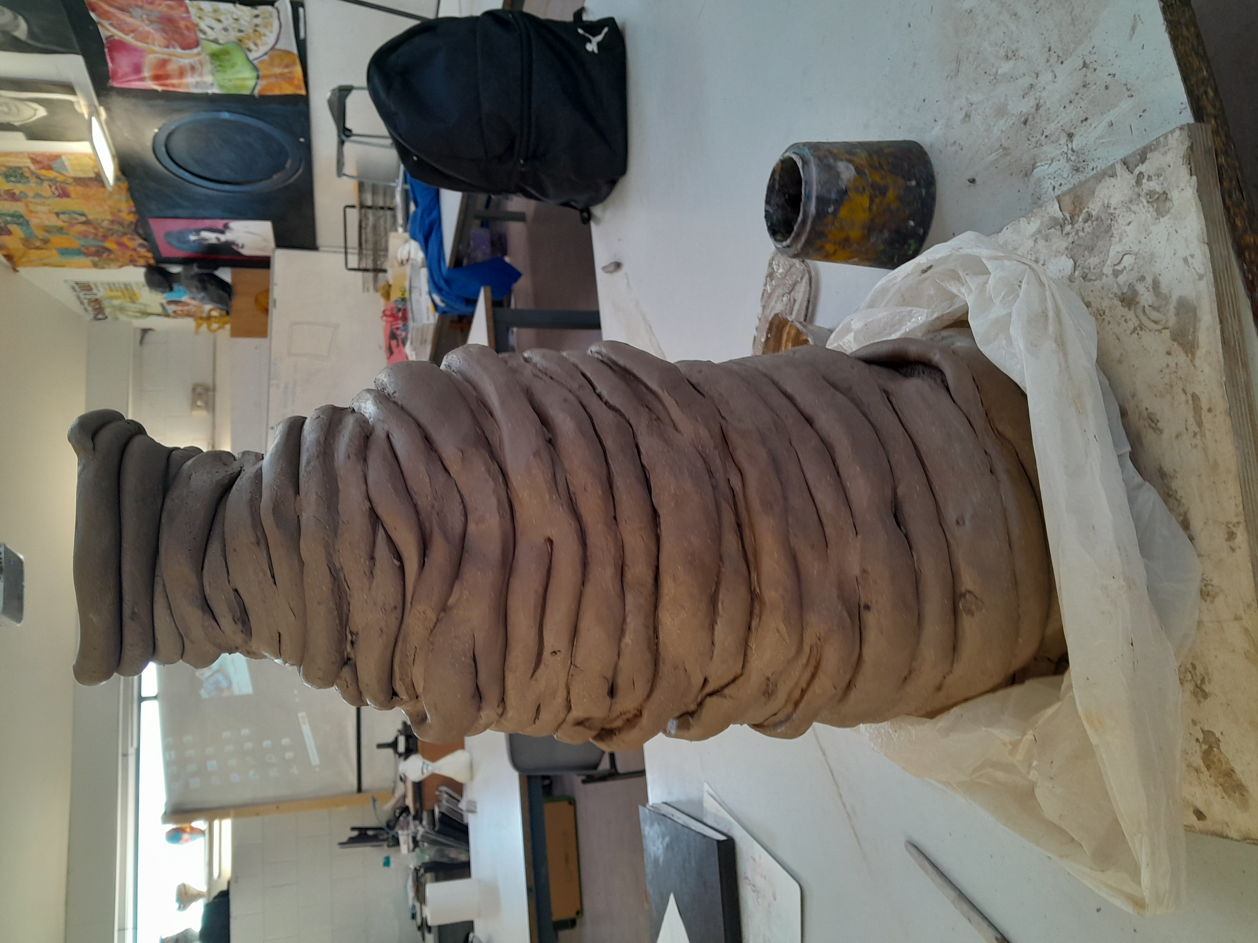
I worked on this piece as my final piece. It is a larger version of the maquett I first completed. It was a shame that I ran out of time to finish it, however, because I really enjoyed working on it.
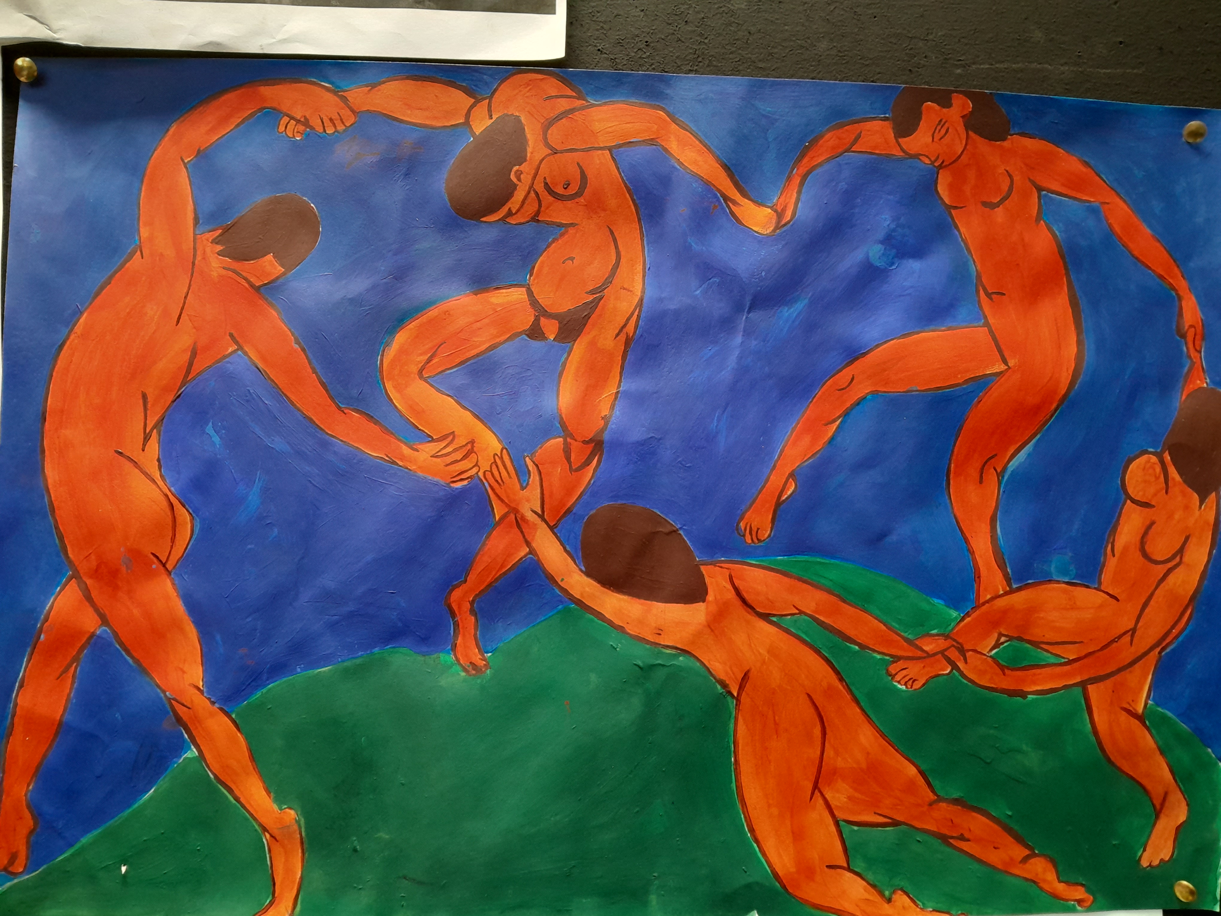
This is a copy of the work of Henri Matisse.
I chose his work because I like his bold, flat colours and it helped me work on my colour matching. This took me around 2 days to complete, i also choose it because it linked well with my theme of ‘body’.
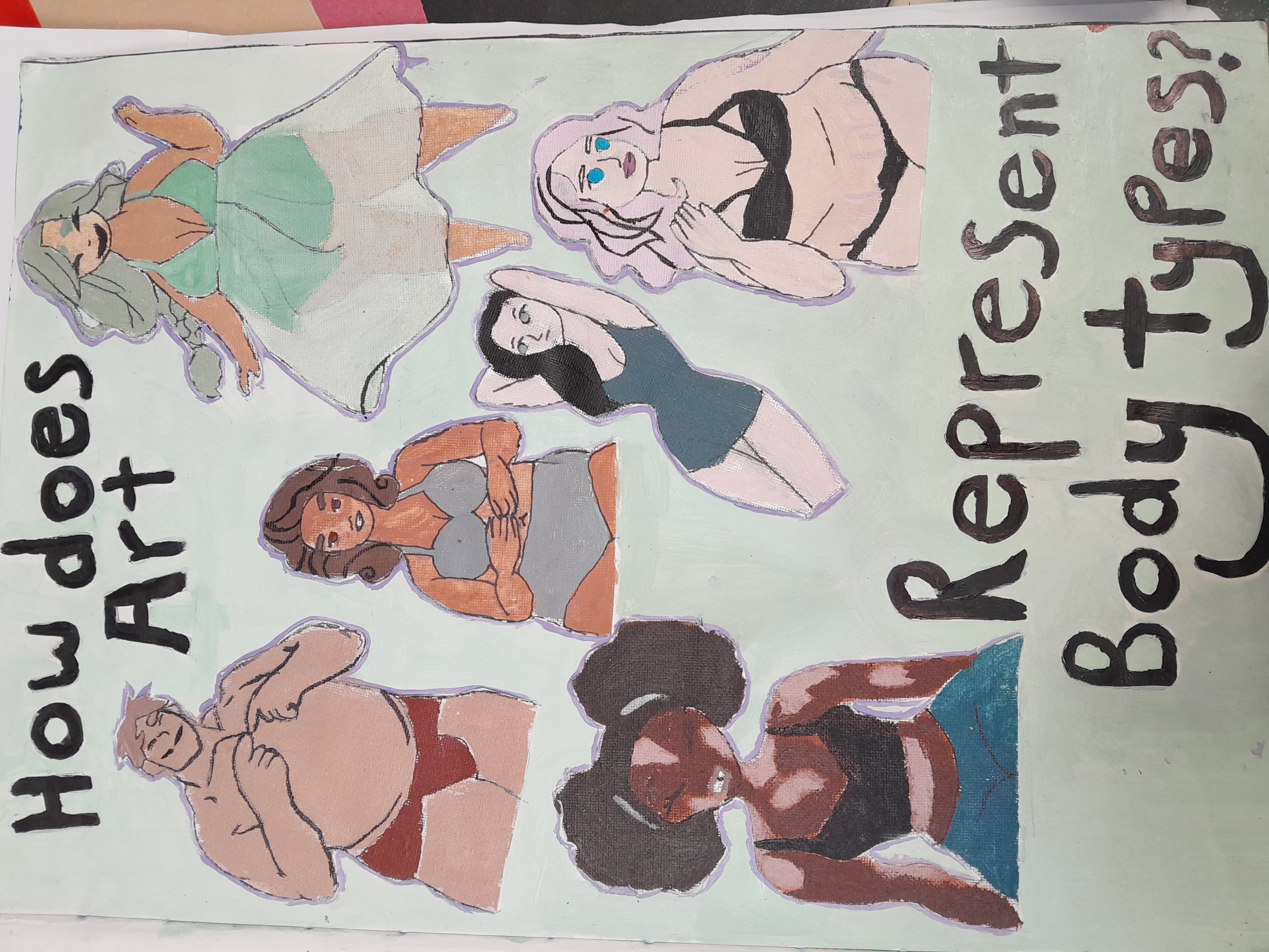
I used this as my title page in my year 13 Art book. It represents all the types of bodies, it also shows that all bodies are beautiful.

This was my ‘media mix up’ based on all of the artists that I had used by that time. The work includes acrylic with techniques such as dabbing, scrapping, blotting and classical.

This is a page from my sketchbook. I used this when I was focusing on the fact that the human body resembles bottles, all of different shapes and sizes.
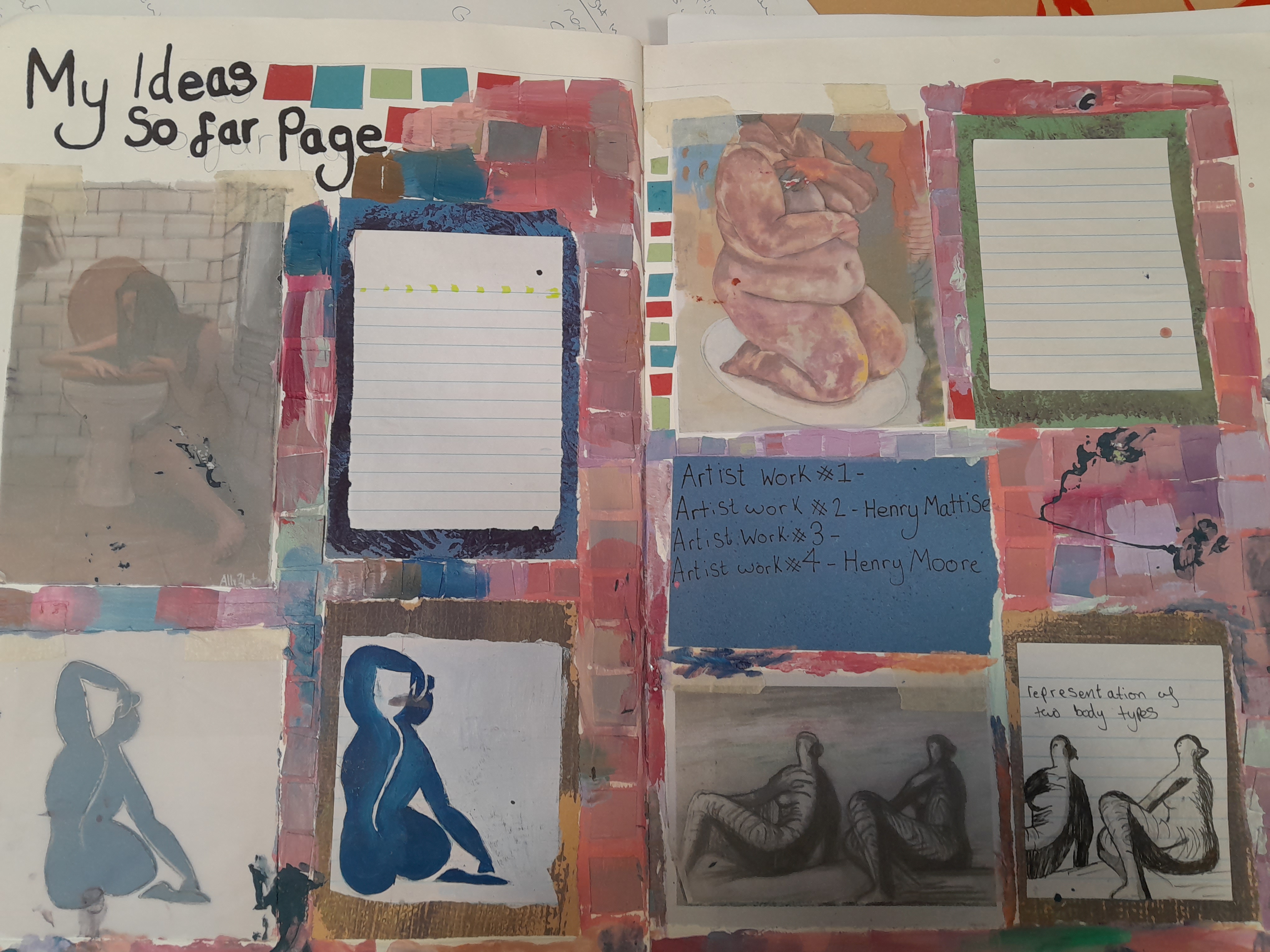
This was my artist study page, this includes the work of the artist that I moved on to and studied further into my topic.
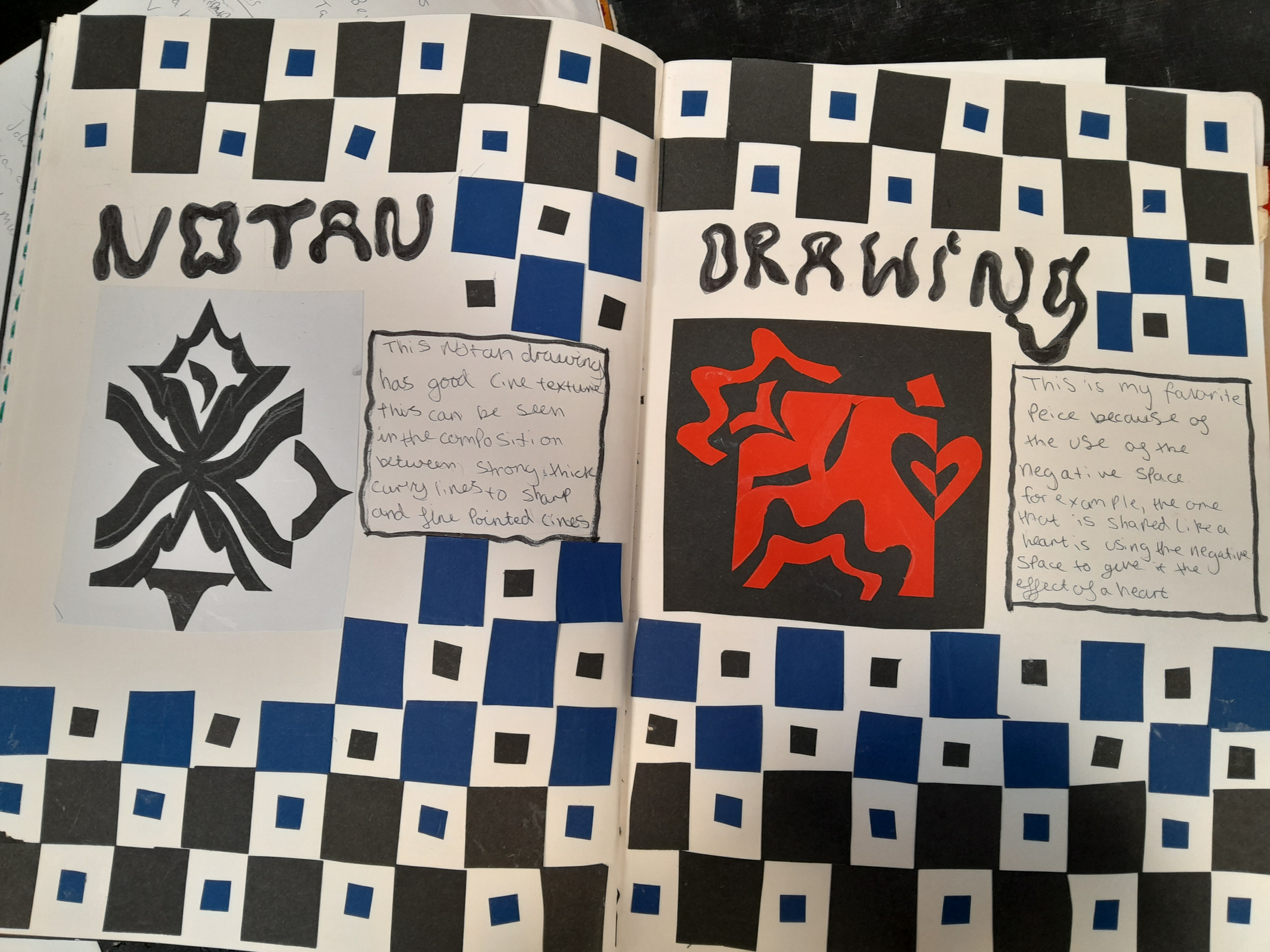
This was a page from my year 12 book that I have always really liked. It took me quite a while to complete but it was worth it to see how beautifully it turned out. This was based on my work on Notan at the time.

I did this while working on my etch prints. I liked how it turned out and I am fascinated by the fact that the deeper you press, the darker the lines will be. I used that do create some dark areas and some light.
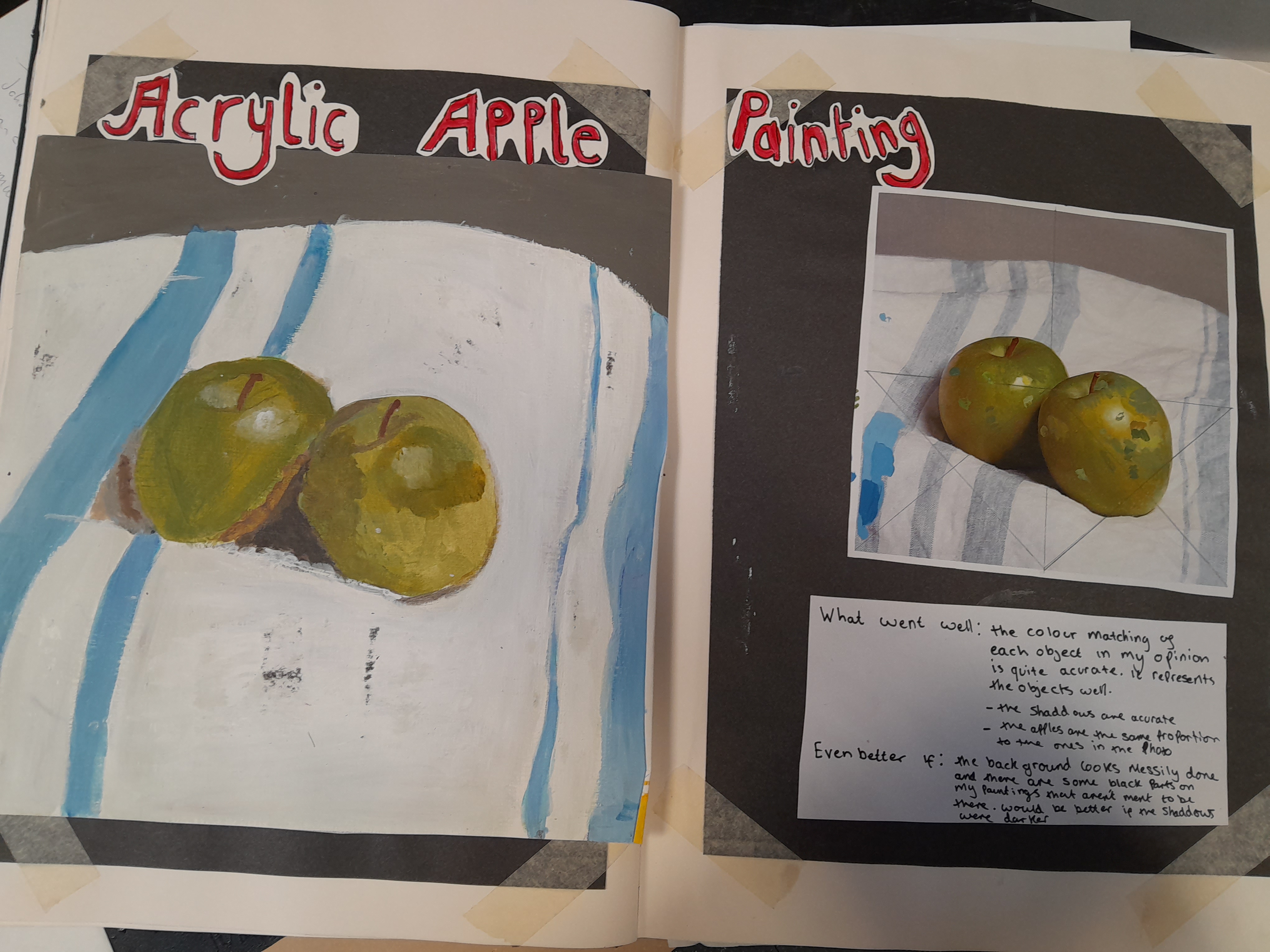
This was a page from my year 12 book on where we were working on copying and colour matching.

This was a piece I did at the start of the year. This work is based on Antony Gormley. When i first looked at his sculptures, personally it shows the imperfections of humans and their feelings of confusion, anxiety and fear, which is represented in the wire surrounding the figure.
This was a photoshoot that I completed as I also take photography. This is one of my favourite shoots that I have done because of the look on the models face. I also like how his hand has made marks down the walls and how I made the paint look like real blood.
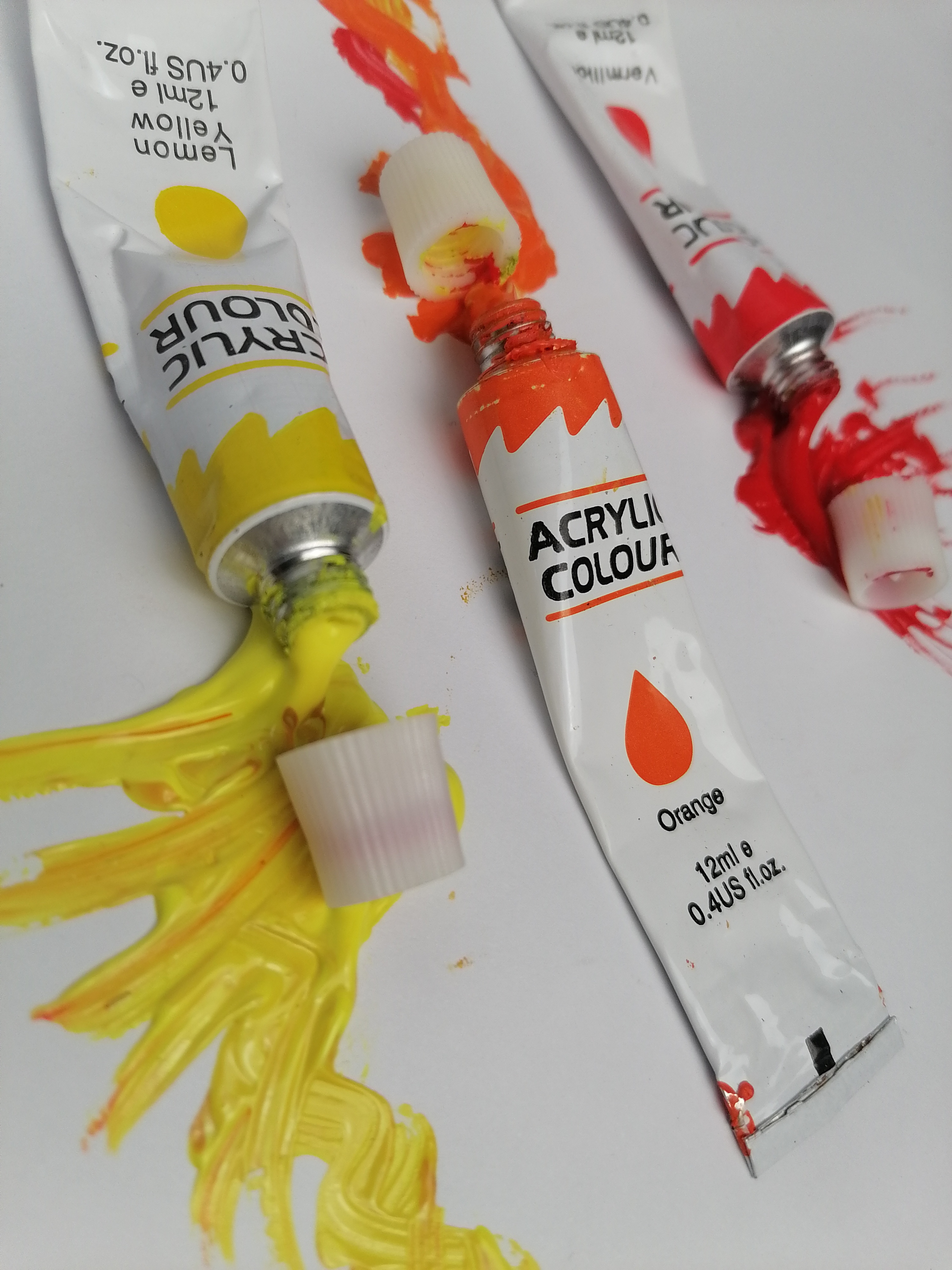
This was also a photography shoot that I had completed. Personally, the colours represent different brush strokes so that is why each one has a different brush stroke.
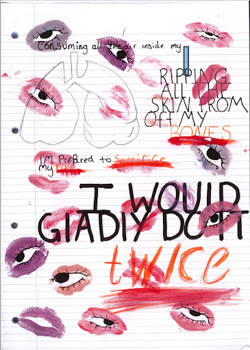
This is a typography piece that I created in my spare time. My teacher said that it was beautiful so I decided to add it to my portfolio because I also really enjoy looking at it. It was fun to make as I had to put on lipstick and then kiss the paper to create the eyelids for the piece.